Hello,
I am trying to reproduce a graph that was made in Stata that has the following legend:
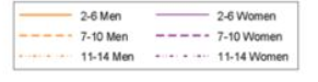
I have been trying to change the legend so that is the same as the previous image but so far I have no clue how to do it. So far I have the following script:
ggplot(joinpoint214, aes(x=anno, y=tasa, color=sex, linetype=age))+
geom_line(size=1.05)+
theme_bw()+
theme(legend.position = "bottom", legend.box="vertical")+
scale_linetype_manual(name=element_blank(), values=c("solid", "twodash", "dotted"), breaks = c("2-6", "7-10", "11-14"))+
scale_color_manual(name = element_blank(), values =c("orange","purple"))+
scale_y_continuous(limits = c(0,1.5)) +
scale_x_continuous(breaks = c(2000:2015)) +
labs(x=element_blank(), y="Hospitalization Rate per 1,000 inhabitant")
The graph that I obtained has 6 lines and basically I want to put a name of each of the line but instead I have two separate legends one for Men-Women and the colors orange and purple and another one for the linetype of each age category.
I don't know if there is a way to maybe duplicate the legend of the age category because in that case I can change the labels but now when I try to change it I have 3 elements for age and 2 for sex instead of the 6 lines that I actually have. Or a way to merge both so that each linetype has a color accourding to the image.
I don't know if I explain myself correctly. I hope there is a way to do it.
Thank you for your time!