This is a companion discussion topic for the original entry at https://rviews.rstudio.com/2021/10/20/a-beginner-s-guide-to-shiny-modules
This post by Emily Riederer is the winning entry in our recent Call for Documentation contest. Emily is a Senior Analytics Manager at Capital One where she leads a team building internal analytical tools including R packages, datamarts, and Shiny apps. Outside of work, Emily can be found sharing more code and ideas about analytics on her website, Twitter (@emilyriederer) and GitHub (@emilyriederer).
Shiny modules are often taught as an advanced topic, but they can also be a great way for novice Shiny developers to start building more complex applications. If you already are an R user who likes to think and write functions and understand Shiny basics (i.e. reactivity), then modules for certain types of tasks (discussed at the end of this post) are an excellent way to up your game.
Shiny’s tendency toward monolithic scripts and lack of function-based thinking in introductory materials felt so unlike normal R programming. So, not only is it possible to learn modules early, it may actually be decidedly easier than the alternative depending on your frame of mind.
In this post, I walk through a toy example of building a reporting app from the flights data in the nycflights13 package to demonstrate how modules help scale basic Shiny skills.
Why Modules?
Modules act like functions by wrapping up sets of Shiny UI and server elements. You may wonder why you cannot just accomplish this with the normal R functions. The reason for this is a bit technical and is explained well in Mastering Shiny . However, the technical knowledge needed to understand “why functions don’t work” should not make modules an advanced topic. If you see the value of writing functions, you are more than ready to take advantage of modules in app development.
Motivating Example
For the sake of argument, let’s pretend that we are building an airline dashboard to track travel delays against established thresholds. We have the following requirements:
- Let users pick a month of interest to visualize
- For each metric of interest, users should be able to:
- See a time-series plot of the average daily value of the metric
- Download a PNG of the plot
- Read a text summary of how often the value breached the threshold
- The metrics of interest are:
- Average departure delay
- Average arrival delay
- Proportion of daily flights with an arrival delay exceeding 5 minutes
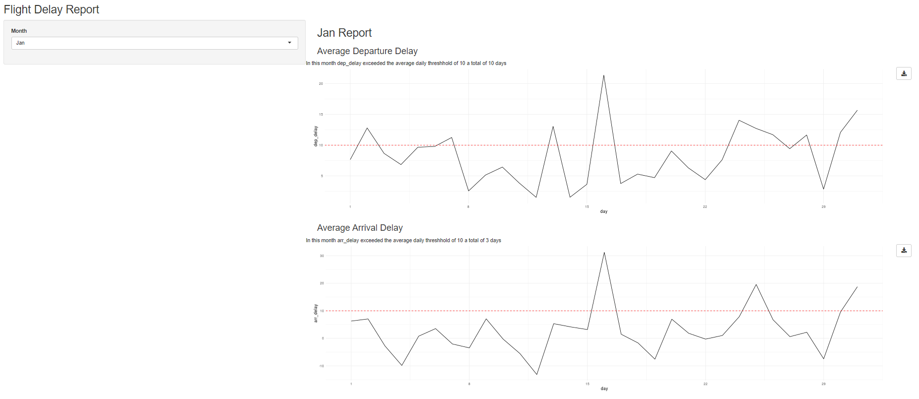
Below is a preview of the final application. The full app is currently hosted in ShinyApps.io and the code available on GitHub. It would not win any beauty contests, but its simple style allows us to focus on modules in the code.
Set-Up
library(shiny)
library(nycflights13)
library(dplyr)
##
## Attaching package: 'dplyr'
## The following objects are masked from 'package:stats':
##
##     filter, lag
## The following objects are masked from 'package:base':
##
##     intersect, setdiff, setequal, union
library(ggplot2)
To understand the following explanation, it helps to familiarize yourself with the data. We filter the flights data down to a single airline and aggregate the results by day.
ua_data <-
  nycflights13::flights %>%
  filter(carrier == "UA") %>%
  mutate(ind_arr_delay = (arr_delay > 5)) %>%
  group_by(year, month, day) %>%
  summarize(
    n = n(),
    across(ends_with("delay"), mean, na.rm = TRUE)
    ) %>%
  ungroup()
## `summarise()` has grouped output by 'year', 'month'. You can override using the `.groups` argument.
head(ua_data)
## # A tibble: 6 x 7
##    year month   day     n dep_delay arr_delay ind_arr_delay
##   <int> <int> <int> <int>     <dbl>     <dbl>         <dbl>
## 1  2013     1     1   165      7.65     6.27          0.476
## 2  2013     1     2   170     12.8      7.04          0.458
## 3  2013     1     3   159      8.66    -2.76          0.357
## 4  2013     1     4   161      6.84    -9.86          0.180
## 5  2013     1     5   117      9.66     0.786         0.274
## 6  2013     1     6   137      9.79     3.53          0.409
Next, we define the plotting function that we will use to visualize a month-long timeseries of data for each metric.
viz_monthly <- function(df, y_var, threshhold = NULL) {

  ggplot(df) +
    aes(
      x = .data[["day"]],
      y = .data[[y_var]]
    ) +
    geom_line() +
    geom_hline(yintercept = threshhold, color = "red", linetype = 2) +
    scale_x_continuous(breaks = seq(1, 29, by = 7)) +
    theme_minimal()
}
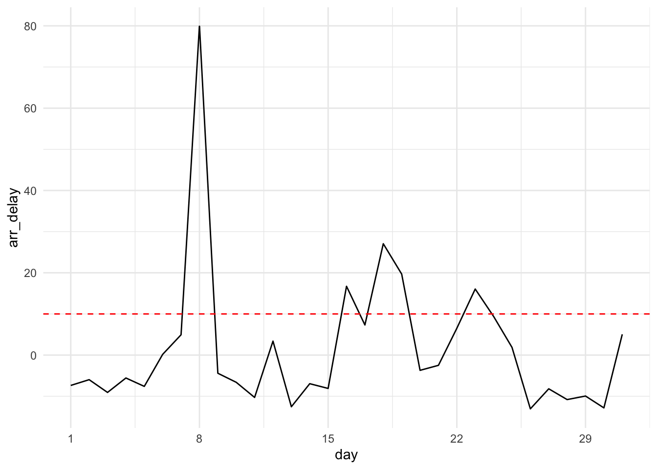
For example, to visualize the average arrival delay by day for all of March and compare it to a threshold of 10 minutes, we can write:
ua_data %>%
  filter(month == 3) %>%
  viz_monthly("arr_delay", threshhold = 10)
One Module at a Time
Modules don’t just help organize your code; they help you organize your thinking . Given our app requirements, it might feel overwhelming where to start. Filtering the data? Making the plots? Wiring up buttons? Inevitably, when juggling many components, you’re likely to introduce a bug by copy-pasting a line with the wrong id or getting nested parentheses out of whack.
Instead, modules essentially allow your to write many simple Shiny apps and compose them together.
For example, we might decide that first we just want to focus on a very simple app: given a monthly subset of the data, a metric, and a threshold of interest. Let’s write a simple text summary of the flights performance. We now know we just need to define a UI ( text_ui ) with a single call to textOutput() , a server ( text_server ) that does a single calculation and calls renderText() . Best of all, we can immediately see whether or not our “app” works by writing a minimalist testing function ( text_demo ) which renders the text for a small, fake dataset.
Those steps are implemented in a file called mod-text.R :
You can find all of the code for this tutorial in this demo Shiny application repository. We can follow the same pattern to create a module for the plot itself (in the file mod-plot.R ) consisting of a UI ( plot_ui ), a server ( plot_server ), and a testing function ( plot_demo ). This module is responsible for plotting one metric and allowing users to download the results.
Composing Modules
We now have a text module and a plot module. However, for each metric of interest, we want to produce both . We could call these two modules one-at-a-time, but we can also compose multiple modules together so that we can produce in single commands everything that we need for a given metric.
With all of the underlying plot and text module logic abstracted, our metric module definition (in the mod-metr.R file) is very clean and simple:
# metric module ----
metric_ui <- function(id) {

  fluidRow(
    text_ui(NS(id, "metric")),
    plot_ui(NS(id, "metric"))
  )

}
metric_server <- function(id, df, vbl, threshhold) {

  moduleServer(id, function(input, output, session) {

    text_server("metric", df, vbl, threshhold)
    plot_server("metric", df, vbl, threshhold)

  })

}
metric_demo <- function() {

  df <- data.frame(day = 1:30, arr_delay = 1:30)
  ui <- fluidPage(metric_ui("x"))
  server <- function(input, output, session) {
    metric_server("x", reactive({df}), "arr_delay", 15)
  }
  shinyApp(ui, server)

}
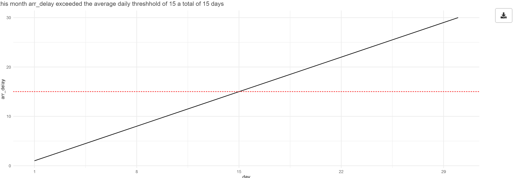
Again, we can test that these components went together as we intended by running the metric_demo() function. We see the text from our text module on top of the plot and button from our plot module:
This may be overkill for a simple app, but composing modules is very useful as your application grows in complexity. Everything you bundle into a module gives you a license to forget about how the next layer lower is implemented and frees up your mind to take on the next challenge.
Putting it all together
Finally, we are ready to write our complete application in a file called flights-app.R :
viz_monthly <- function(df, y_var, threshhold = NULL) {

  ggplot(df) +
    aes(
      x = .data[["day"]],
      y = .data[[y_var]]
    ) +
    geom_line() +
    geom_hline(yintercept = threshhold, color = "red", linetype = 2) +
    scale_x_continuous(breaks = seq(1, 29, by = 7)) +
    theme_minimal()
}

# text module ----
text_ui <- function(id) {

  fluidRow(
    textOutput(NS(id, "text"))
  )

}

text_server <- function(id, df, vbl, threshhold) {

  moduleServer(id, function(input, output, session) {

    n <- reactive({sum(df()[[vbl]] > threshhold)})
    output$text <- renderText({
      paste("In this month",
            vbl,
            "exceeded the average daily threshhold of",
            threshhold,
            "a total of",
            n(),
            "days")
    })

  })

}

text_demo <- function() {

  df <- data.frame(day = 1:30, arr_delay = 1:30)
  ui <- fluidPage(text_ui("x"))
  server <- function(input, output, session) {
    text_server("x", reactive({df}), "arr_delay", 15)
  }
  shinyApp(ui, server)
}

# plot module ----
plot_ui <- function(id) {

  fluidRow(
    column(11, plotOutput(NS(id, "plot"))),
    column( 1, downloadButton(NS(id, "dnld"), label = ""))
  )

}

plot_server <- function(id, df, vbl, threshhold = NULL) {

  moduleServer(id, function(input, output, session) {

    plot <- reactive({viz_monthly(df(), vbl, threshhold)})
    output$plot <- renderPlot({plot()})
    output$dnld <- downloadHandler(
      filename = function() {paste0(vbl, '.png')},
      content = function(file) {ggsave(file, plot())}
    )

  })
}

plot_demo <- function() {

  df <- data.frame(day = 1:30, arr_delay = 1:30)
  ui <- fluidPage(plot_ui("x"))
  server <- function(input, output, session) {
    plot_server("x", reactive({df}), "arr_delay")
  }
  shinyApp(ui, server)
}

# metric module ----
metric_ui <- function(id) {

  fluidRow(
    text_ui(NS(id, "metric")),
    plot_ui(NS(id, "metric"))
  )

}

metric_server <- function(id, df, vbl, threshhold) {

  moduleServer(id, function(input, output, session) {

    text_server("metric", df, vbl, threshhold)
    plot_server("metric", df, vbl, threshhold)

  })

}

metric_demo <- function() {

  df <- data.frame(day = 1:30, arr_delay = 1:30)
  ui <- fluidPage(metric_ui("x"))
  server <- function(input, output, session) {
    metric_server("x", reactive({df}), "arr_delay", 15)
  }
  shinyApp(ui, server)

}
# load libraries ----
library(nycflights13)
library(shiny)
library(ggplot2)
library(dplyr)
# data prep ----
ua_data <-
  nycflights13::flights %>%
  filter(carrier == "UA") %>%
  mutate(ind_arr_delay = (arr_delay > 5)) %>%
  group_by(year, month, day) %>%
  summarize(
    n = n(),
    across(ends_with("delay"), mean, na.rm = TRUE)
    ) %>%
  ungroup()
# full application ----
ui <- fluidPage(

  titlePanel("Flight Delay Report"),

  sidebarLayout(
  sidebarPanel = sidebarPanel(
    selectInput("month", "Month",
                choices = setNames(1:12, month.abb),
                selected = 1
    )
  ),
  mainPanel = mainPanel(
    h2(textOutput("title")),
    h3("Average Departure Delay"),
    metric_ui("dep_delay"),
    h3("Average Arrival Delay"),
    metric_ui("arr_delay"),
    h3("Proportion Flights with >5 Min Arrival Delay"),
    metric_ui("ind_arr_delay")
  )
)
)
server <- function(input, output, session) {

  output$title <- renderText({paste(month.abb[as.integer(input$month)], "Report")})
  df_month <- reactive({filter(ua_data, month == input$month)})
  metric_server("dep_delay", df_month, vbl = "dep_delay", threshhold = 10)
  metric_server("arr_delay", df_month, vbl = "arr_delay", threshhold = 10)
  metric_server("ind_arr_delay", df_month, vbl = "ind_arr_delay", threshhold = 0.5)

}
shinyApp(ui, server)
You can find all of the code for this tutorial in this demo Shiny application repository.
Notice how few lines of code this file requires to create all of our components and interactions! We’ve eliminated much of the dense code, nesting, and potential duplication we might have encountered if trying to write our application without modules. The top-level code is accessible, semantic, and declarative. It is easy to understand the intent of each line and which pieces of UI and server logic are responsible for which components.
Not all modules are made alike, and in this walk-through I chose simple tasks to demonstrate. Note that our modules consume a reactive variable (data) from the environment, but they do not attempt to alter the global environment or exchange information between them. Modules that simply consume reactives are the easiest way to start out.
Note from the Editor: Emily’s winning entry displays several characteristics of good technical writing. She is laser focused on her audience: R users who have some Shiny experience but who are not familiar with modules. Emily’s prose is direct, simple, informal and engaging. Reading it, I feel as if Emily is beside me showing me how things work, and that she cares about me understanding it. Emily’s code is spacious, and laid out to be read by others. And maybe not so obvious on the first reading, Emily’s writing is disciplined. It is clear that she knows a lot more about things than she has has put into the post, but is working under self imposed constraints in pursuit of clarity.


