Hello,
I would like to make a noctodiurnal plot of a continuous outcome variable (here: systolic blood pressure in one patient), that has been measured under condition 1 (taking no medication) on arbitrary moments of the day for a month, followed by condition 2 (taking a pressure lowering drug) for a month. So even though the experiment involves a period of two months, I am only interested in the time component of the date-time variable in this plot. I would like to make a polar plot but faced 2 problems as shown in my first example below. Following plots are unsuccessful other attempts.
First approach:
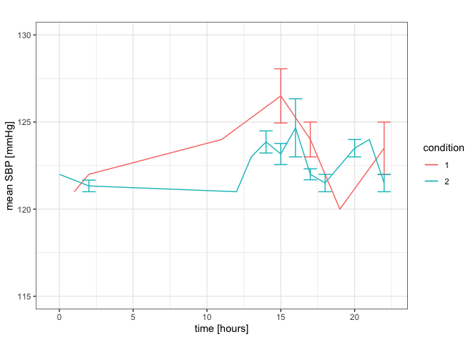
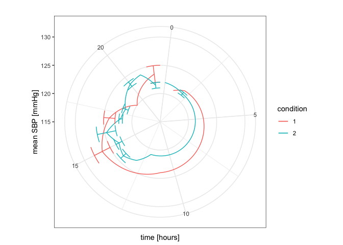
I changed the date-time variable to hours, which works fine for a line graph. However, when changing the line graph into a polar plot, I can't connect the lines between 23:00 and 0:00 (apart from positioning the time axis, with e.g. the time label of 0 hours exactly vertically on top).
library(dplyr, warn.conflicts = FALSE)
library(lubridate, warn.conflicts = FALSE)
library(ggplot2)
library(plotrix)
library(circular)
#>
#> Attaching package: 'circular'
#> The following objects are masked from 'package:stats':
#>
#>     sd, var
library(xts)
#> Loading required package: zoo
#>
#> Attaching package: 'zoo'
#> The following objects are masked from 'package:base':
#>
#>     as.Date, as.Date.numeric
#>
#> Attaching package: 'xts'
#> The following objects are masked from 'package:dplyr':
#>
#>     first, last
library(tsibble)
#>
#> Attaching package: 'tsibble'
#> The following object is masked from 'package:zoo':
#>
#>     index
#> The following object is masked from 'package:lubridate':
#>
#>     interval
#> The following object is masked from 'package:dplyr':
#>
#>     id
library(tsbox)
library(forecast)
#> Registered S3 method overwritten by 'quantmod':
#>   method            from
#>   as.zoo.data.frame zoo

a <- data.frame(date.time = c("2015-12-12 01:25:00 CET", "2015-12-15 15:31:00 CET", "2015-12-15 15:31:00 CET", "2015-12-16 17:25:00 CET", "2015-12-17 15:45:00 CET", "2015-12-18 11:55:00 CET", "2015-12-24 02:32:00 CET", "2015-12-24 17:52:00 CET", "2015-12-26 19:25:00 CET", "2016-01-04 22:17:00 CET", "2016-01-07 15:30:00 CET", "2016-01-09 22:44:00 CET", "2016-01-12 14:32:00 CET", "2016-01-12 14:33:00 CET", "2016-01-12 14:33:00 CET", "2016-01-12 14:33:00 CET", "2016-01-12 14:33:00 CET", "2016-01-12 15:00:00 CET", "2016-01-12 15:47:00 CET", "2016-01-12 15:48:00 CET", "2016-01-12 15:48:00 CET", "2016-01-12 15:49:00 CET", "2016-01-12 15:49:00 CET","2016-01-12 15:49:00 CET", "2016-01-12 15:50:00 CET", "2016-01-12 16:50:00 CET", "2016-01-12 17:04:00 CET", "2016-01-12 17:05:00 CET", "2016-01-12 17:05:00 CET", "2016-01-12 17:05:00 CET", "2016-01-12 18:05:00 CET", "2016-01-12 18:06:00 CET", "2016-01-12 18:06:00 CET", "2016-01-12 18:06:00 CET", "2016-01-12 21:32:00 CET", "2016-01-16 00:51:00 CET", "2016-01-18 20:59:00 CET", "2016-01-20 22:27:00 CET", "2016-01-20 22:27:00 CET", "2016-01-21 16:30:00 CET", "2016-01-25 14:35:00 CET", "2016-01-25 14:36:00 CET", "2016-01-26 17:18:00 CET", "2016-01-27 15:01:00 CET", "2016-01-28 02:10:00 CET", "2016-01-28 16:49:00 CET", "2016-02-04 02:11:00 CET", "2016-02-04 02:11:00 CET", "2016-02-04 13:06:00 CET", "2016-02-04 20:32:00 CET", "2016-02-07 12:15:00 CET", "2016-02-08 15:19:00 CET", "2016-02-08 15:20:00 CET", "2016-02-09 15:43:00 CET"),
                condition =  c(1, 1, 1, 1, 1, 1, 1, 1, 1, 1, 1, 1, 2, 2, 2, 2, 2, 2, 2, 2, 2, 2, 2, 2, 2, 2, 2, 2, 2, 2, 2, 2, 2, 2, 2, 2, 2, 2, 2, 2, 2, 2, 2, 2, 2, 2, 2, 2, 2, 2, 2, 2, 2, 2),
                sbp = c(121, 127, 129, 125, 128, 124, 122, 123, 120, 125, 122, 122, 123, 121, 124, 123, 125, 121, 123, 122, 121, 121, 124, 124, 121, 123, 122, 122, 121, 123, 121, 123, 121, 121, 124, 122, 124, 122, 121, 123, 125, 126, 122, 125, 122, 128, 121, 121, 123, 123, 121, 126, 127, 123))
a$date.time <- as.POSIXct(a$date.time)
a$condition <- factor(a$condition)

#hourly data with lubridate and dplyr
a1 = a[-1]
a1$time <- lubridate::hour(a$date.time)
a1 <- a1 %>%
  group_by(condition, time) %>%
  dplyr::summarise(mean = mean(sbp, na.rm = TRUE), se = sd(sbp, na.rm = TRUE)/sqrt(n()))

#ggplot2 package
plot1 <- ggplot2::ggplot(a1, aes(x = time, y = mean, colour = condition)) +
  geom_line() +
  geom_errorbar(aes(ymin = mean - se, ymax = mean + se)) +
  ylim(115, 130) +
  labs(title = "", x = "time [hours]", y = "mean SBP [mmHg]")+
  theme_bw()
plot1
plot1 + coord_polar(start = 0, direction = 1)
Created on 2020-05-29 by the reprex package (v0.3.0)
My question is basically how to improve the polar plot, but below my other attempts / considerations.
Second approach:
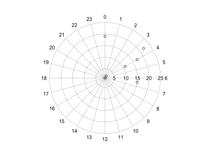
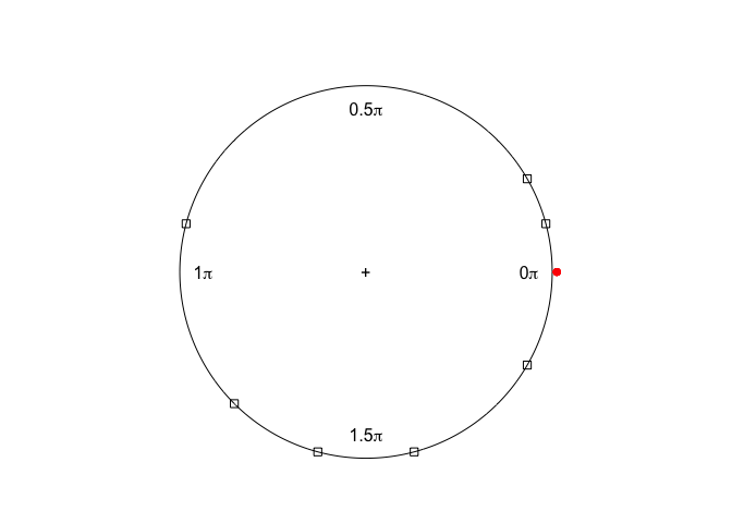
Maybe an option would be using a radar plot, a clock24.plot, or the circular package. I couldn't figure out how to use those, some try-outs:
#try outs:
a2 <- subset(a1, condition == 1)
#plotrix package
plot2 <- clock24.plot(a2$time, a2$mean, rp.type="s")
#circular package
x <- as.circular(a2$time, control.circular=list(units="hours", zero=0))
#> Warning in as.circular(a2$time, control.circular = list(units = "hours", : an object is coerced to the class 'circular' using default value for the following components:
#>   type: 'angles'
#>   template: 'none'
#>   modulo: 'asis'
#>   rotation: 'counter'
#> evalexprenvirenclos
y <- conversion.circular(circular(a2$mean), zero=a2$mean)
plot3 <- plot(x,y)
points(y, col=2, plot.info=plot3)
Created on 2020-05-29 by the reprex package (v0.3.0)
Third approach:
I considered the data as time series. I am not sure whether it would suit this data though, as example vignettes that I read were more related to number of observations per month during several years. E.g. https://otexts.com/fpp2/seasonal-plots.html
I couldn't change the data to a time-series object (attempts below). I would be interested to make a ggseasonplot with polar = TRUE, but only managed to make one autoplot.
#time series
#using as_tsibble()
a3 <- distinct(a) %>%
as_tsibble(
index=date.time,
key = condition)
#> Error: A valid tsibble must have distinct rows identified by key and index.
#> Please use `duplicates()` to check the duplicated rows.
#using ts()
a4 <- subset(a, condition ==1)
a5 <- ts(a4, frequency=24, start=c(2015, 12), end =c(2016, 3))
plot4 <- autoplot(a5)
plot5 <- ggseasonplot(a5)
#> Error in data.frame(y = as.numeric(x), year = trunc(round(time(x), 8)), : arguments imply differing number of rows: 48, 16
#using xts()
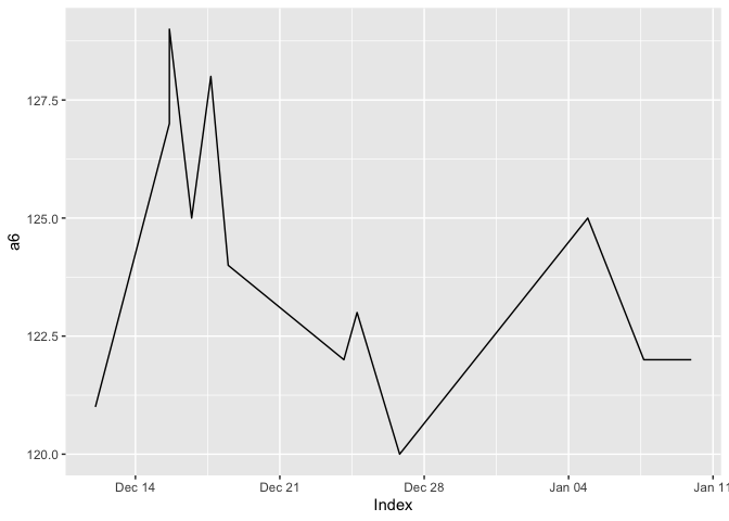
a6 <- xts(x = a4$sbp, order.by = a4$date.time)
plot6 <- autoplot(a6)
plot6
plot7 <- ggseasonplot(a6)
#> Error in ggseasonplot(a6): autoplot.seasonplot requires a ts object, use x=object
a7 <- xts(x = a4, order.by = a4$date.time)
plot8 <- autoplot(a7)
Created on 2020-05-29 by the reprex package (v0.3.0)
I hope someone can help me gain insight in polar or other circular plots and whether ts objects would be useful here.