Race Track Plot

Good day,
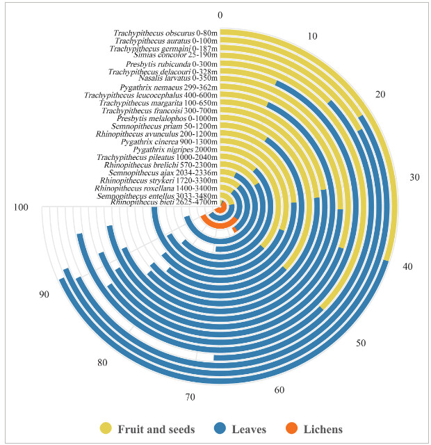
I am trying to create a race track plot similar to this:

I want to display the proportion of species for sites. And I am doing something wrong.

Thanks!

I created a dummy dataset with three sites, and four species. Proportions add up to 100%.
tibble::tribble(
~site, ~spp, ~prop,
"site1", "A", 80,
"site1", "B", 10,
"site1", "C", 5,
"site1", "D", 5,
"site2", "A", 50,
"site2", "B", 25,
"site2", "C", 25,
"site2", "D", 0,
"site3", "A", 75,
"site3", "B", 10,
"site3", "C", 10,
"site3", "D", 10
)

And my code:

rt$site <- as.factor(rt$site)
#> Error in rt$site: object of type 'closure' is not subsettable
rt$spp <- as.factor(rt$spp)
#> Error in rt$spp: object of type 'closure' is not subsettable
class(rt$prop)
#> Error in rt$prop: object of type 'closure' is not subsettable
rt$prop <- as.numeric(rt$prop)
#> Error in rt$prop: object of type 'closure' is not subsettable


plot5<- ggplot(rt, aes(x = site, y = prop,
              fill = spp)) + 
  geom_bar(width = 0.9, stat="identity") + 
  coord_polar(theta = "y") +
  xlab("") + ylab("") +
  ylim(c(0,100)) +
  ggtitle("Test for Species") +
  geom_text(data = rt, hjust = 1, size = 3,
            aes(x = site, y = 0, label = site)) +
  theme_minimal() +
  theme(legend.position = "right",
        panel.grid.major = element_blank())#,
#> Error in ggplot(rt, aes(x = site, y = prop, fill = spp)): could not find function "ggplot"
  #       panel.grid.minor = element_blank(),
  #       axis.line = element_blank(),
  #       axis.text.y = element_blank(),
  #       axis.text.x = element_blank(),
  #       axis.ticks = element_blank())

plot5
#> Error in eval(expr, envir, enclos): object 'plot5' not found

Created on 2024-04-16 with reprex v2.1.0

The missing bar for site3 is caused by setting the ylim to 0 - 100 but having the sum of site3 be 105. I edited your data to reduce that to 100.

library(tidyverse)
rt <- tibble::tribble(
~site, ~spp, ~prop,
"site1", "A", 80,
"site1", "B", 10,
"site1", "C", 5,
"site1", "D", 5,
"site2", "A", 50,
"site2", "B", 25,
"site2", "C", 25,
"site2", "D", 0,
"site3", "A", 75,
"site3", "B", 10,
"site3", "C", 10,
"site3", "D", 5
)
rt$site <- as.factor(rt$site)
rt$spp <- as.factor(rt$spp)
class(rt$prop)
#> [1] "numeric"
rt$prop <- as.numeric(rt$prop)


plot5<- ggplot(rt, aes(x = site, y = prop,
                       fill = spp)) + 
  geom_col(width = 0.9) + 
  coord_polar(theta = "y") +
  xlab("") + ylab("") +
  ylim(c(0,100)) +
  ggtitle("Test for Species") +
  geom_text(data = rt, hjust = 1, size = 3,
            aes(x = site, y = 0, label = site)) +
  theme_minimal() +
  theme(legend.position = "right",
        panel.grid.major = element_blank())#,


plot5

Created on 2024-04-16 with reprex v2.0.2

@FJCC thank you for your help

If you want that 3/4 pie, you can use coord_radial in stead of coord_polar.

Hopefully you're already on your way!

I did want to chime in from a data presentation standpoint that although it's a cool looking plot, I'd argue it's more difficult to interpret than a bar plot. Namely because the immediate reaction to a graph is to assume the proportional size is meaningful. In this case, with the nested lines, that isn't true and you need to compare the relative size to the values listed on the radius.

On a somewhat related note, I only use pie charts with radial axes when I want to show each category's ratio out of a total that is 100% (e.g. votes), which I think works better in that case than a bar chart.