How to change size of percent labels in `plot_pizza()` plot?

Hi,

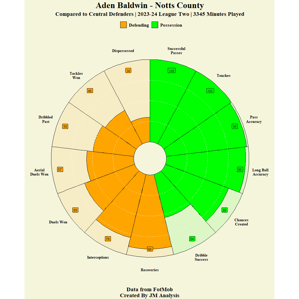
I have done a Pizza Plot - attached below.

The code is:
plot_pizza(data = Aden_Baldwin_New,
type = "single",
template = "custom",
color_possession = "lightgreen",
color_defense = "orange",
season = "2023-24 League Two",
theme = "dark")+
labs(fill="",
title= ("Aden Baldwin - Notts County"),
subtitle = (" Compared to Central Defenders | 2023-24 League Two | 3345 Minutes Played "),
caption = "Data from FotMob\nCreated By JM Analysis") +
theme_minimal() +
theme(plot.background = element_rect(fill = "beige",
color = "beige"),
panel.background = element_rect(fill = "beige",
color = "beige"),
legend.position = "top",
axis.title.y = element_blank(),
axis.title.x = element_blank(),
axis.text.y = element_blank(),
axis.text.x = element_text(size = 12,
colour = "black",
family = "serif",
face = "bold"),
text = element_text(colour= "black",
size = 14,
hjust = 0.5,
family = "serif",
face = "bold"),
plot.title = element_text(colour = "black",
face = "bold",
hjust=0.5,
family = "serif",
size= 22),
plot.subtitle = element_text(face = "bold",
hjust=0.5,
family = "serif",
size=14),
plot.caption = element_text(hjust=0.5,
size=14,
family = "serif",
face = "bold"),
panel.grid.major = element_blank(),
panel.grid.minor = element_blank(),
plot.margin = margin(15,12,12,12))

How do I go about changing the size/position of the labels with the percentile numbers in please as they are currently quite small.

Many Thanks
James

Hi James,

It looks like you'd have to make a small change the plot_pizza() code (meaning the code that builds the plot_pizza() function, not the code you shared that uses the plot_pizza() function), which seems to have the label size hardcoded.

Thanks for that. How would this be done in RStudio please as I'm relatively new to this.

One possibility is to use the ggplot_build function to make an editable version of the plot object, change the desired values and use ggplot_gtable() to make a new object to plot. You will have to inspect the result of ggplot_build to find where the size of the labels is stored. Here is an example with a simple plot.

DF <- data.frame(X=1:3, Y = 2:4, T = c("A","B","C"))
library(ggplot2)
#> Warning: package 'ggplot2' was built under R version 4.3.3
Plt2 <- ggplot(DF, aes(X,Y,label = T)) + geom_point() + 
  geom_label(nudge_x = 0.15, size = 4)
Plt2


Plt2Build <- ggplot_build(Plt2)

# I manually inspected Plt2Build to find where the size is stored
Plt2Build$data[[2]][["size"]] = c(2,6,8)  

Plt2gtable <- ggplot_gtable(Plt2Build)
plot(Plt2gtable)

Created on 2024-06-29 with reprex v2.0.2

1 Like

Thanks for your feedback. I have managed to add geom_label code in to put labels in which looks better. How do I go about removing the standard labels that come when I plot this.

Also, how do i go about moving the axis text further away from the plot

To move text away from the plot, you could try increasing the top margin of your x-axis labels by setting the margin argument in the element_text() call I quoted above:

axis.text.x = element_text(
  margin = margin(t = 10, r = 0, b = 0, l = 0), # trbl: top, bottom, right, left
  size = 12,
  colour = "black",
  family = "serif",
  face = "bold"
)

Aside from modifying the plot_pizza() function in advance of using it, you could follow @FJCC 's advice about how to modify the output of plot_pizza(). Either approach would depend on you having enough experience using R in order to implement them — how would you describe your level of experience using R?

Thanks for that. I will look to implement the text margin code now.

I would say my experience using R is limited, I used it for University assessments but on that occassion didn't use pizza plots. So when it comes to pizza plots my experience using R is pretty basic