This is my first time using shiny and I get the message "Disconnected from the server. Reload". But when I run it locally it works. My code:
library(shiny)
library(survey)
library(haven)
library(highcharter)
library(dplyr)
library(DT)
library(htmltools)


data <- readRDS("data/data.rds")


design <- svydesign(
  id = ~upm,
  strata = ~estrato,
  weights = ~fexpm,
  data = data,
  nest = TRUE,
  variance = "HT",
  single.unit = "certainty"
)

prov_names <- c(
  "1" = "Azuay", "2" = "Bolivar", "3" = "Cañar", "4" = "Carchi", "5" = "Cotopaxi",
  "6" = "Chimborazo", "7" = "El Oro", "8" = "Esmeraldas", "9" = "Guayas", "10" = "Imbabura",
  "11" = "Loja", "12" = "Los Rios", "13" = "Manabi", "14" = "Morona Santiago", "15" = "Napo",
  "16" = "Pastaza", "17" = "Pichincha", "18" = "Tungurahua", "19" = "Zamora Chinchipe", "20" = "Galápagos",
  "21" = "Sucumbios", "22" = "Orellana", "23" = "Santo Domingo de los Tsáchilas", "24" = "Santa Elena",
  "90" = "Zonas no delimitadas"
)

ui <- fluidPage(
  titlePanel(
    title = "Violencia contra las mujeres",  # Nuevo título
    windowTitle = "Violencia contra las mujeres"  # Título de la ventana
  ),

  # Añadir subtítulos debajo del título principal
  fluidRow(
    column(12,
           h4("Silvio Guerra Burbano"),
           h5("sguerra330@puce.edu.ec"),
           h5("IIE – PUCE")
    )
  ),

  sidebarLayout(
    sidebarPanel(
      selectInput("variable", "Tipo de violencia:",  # Cambiado a "Tipo de violencia"
                  choices = c("Violencia Total" = "viotot",
                              "Violencia Psicológica" = "vpsittm",
                              "Violencia Física" = "vfittm",
                              "Violencia Sexual" = "vsttm",
                              "Violencia Económica/Patrimonial" = "vecttm",
                              "Violencia Gineco-Obstétrica" = "gin_obst")),
      selectInput("desagregacion", "Desagregar por:",  # Nombres personalizados para las opciones
                  choices = c(
                    "Autoidentificación étnica" = "etnia",
                    "Grupos de edad" = "edad",
                    "Estado conyugal" = "civil",
                    "Región" = "rn",
                    "Provincia" = "prov",
                    "Nivel de instrucción" = "educ",
                    "Área" = "area"
                  ))
    ),
    mainPanel(
      highchartOutput("plot"),  # Muestra primero el gráfico
      DTOutput("table")  # Luego la tabla
    )
  )
)

server <- function(input, output) {

  output$table <- renderDT({
    denominator_var <- if (input$variable == "gin_obst") "mujeres3" else "muj_sel"

    ratio_result <- svyby(
      as.formula(paste0("~", input$variable)),
      ~get(input$desagregacion),
      design,
      svyratio,
      denominator = as.formula(paste0("~", denominator_var)),
      vartype = c("ci", "cv")
    )

    ratio_df <- as.data.frame(ratio_result)

    desagregacion_var <- as_factor(data[[input$desagregacion]])
    if (!is.null(levels(desagregacion_var))) {
      etiquetas <- levels(desagregacion_var)[ratio_df$`get(input$desagregacion)`]
      ratio_df$Detalle <- etiquetas
    } else {
      ratio_df$Detalle <- as.character(ratio_df$`get(input$desagregacion)`)
    }

    ratio_df$`Prevalencia (%)` <- round(ratio_df[[paste0(input$variable, "/", denominator_var)]] * 100, 2)
    ratio_df$`Límite inferior (%)` <- round(ratio_df$ci_l * 100, 2)
    ratio_df$`Límite superior (%)` <- round(ratio_df$ci_u * 100, 2)
    ratio_df$`Error estándar` <- round(SE(ratio_result), 2)
    ratio_df$`Coeficiente de variación (%)` <- round((SE(ratio_result) / coef(ratio_result)) * 100, 2)

    ratio_df <- ratio_df[, c("Detalle", "Prevalencia (%)", "Límite inferior (%)",
                             "Límite superior (%)", "Error estándar",
                             "Coeficiente de variación (%)")]

    tags$head(
      tags$style(HTML("
    .dt-buttons {
      width: 100%;
      text-align: center;
    }
    .dt-buttons .btn {
      margin: 0 auto;
    }
  "))
    )


    datatable(ratio_df, extensions = 'Buttons', options = list(
      paging = FALSE,   # Deshabilita la paginación para mostrar todas las filas automáticamente
      searching = FALSE, # Elimina la barra de búsqueda
      info = FALSE,  # Elimina el mensaje de "Showing X to Y of Z entries"
      autoWidth = TRUE,
      scrollX = TRUE,
      dom = 'Bfrtip',  # Coloca los botones en la parte superior
      buttons = list(
        list(extend = 'collection', text = 'Descargar los datos:', buttons = c('copy', 'csv', 'excel', 'pdf', 'print'))
      ),
      columnDefs = list(
        list(className = 'dt-center', targets = "_all")  # Centrar todas las columnas
      )
    ))

  })

  output$plot <- renderHighchart({
    denominator_var <- if (input$variable == "gin_obst") "mujeres3" else "muj_sel"

    if (input$desagregacion == "prov") {
      datos_prov <- svyby(as.formula(paste0("~", input$variable)), ~prov, design, svyratio, denominator = as.formula(paste0("~", denominator_var)))
      datos_prov <- as.data.frame(datos_prov)

      datos_prov$prov <- prov_names[as.character(datos_prov$prov)]

      datos_prov$prevalencia <- round(datos_prov[[paste0(input$variable, "/", denominator_var)]] * 100, 2)

      hcmap("countries/ec/ec-all",
            data = datos_prov,
            joinBy = c("name", "prov"),
            value = "prevalencia",
            name = "Prevalencia (%)",
            borderColor = "#FFFFFF") %>%
        hc_colorAxis(minColor = "#E3F2FD", maxColor = "#0D47A1") %>%
        hc_legend(layout = "vertical", align = "right", verticalAlign = "middle") %>%
        hc_tooltip(valueDecimals = 1, valueSuffix = "%")
    } else {
      ratio_result <- svyby(
        as.formula(paste0("~", input$variable)),
        ~get(input$desagregacion),
        design,
        svyratio,
        denominator = as.formula(paste0("~", denominator_var)),
        vartype = c("ci", "cv")
      )

      ratio_df <- as.data.frame(ratio_result)
      desagregacion_var <- as_factor(data[[input$desagregacion]])
      if (!is.null(levels(desagregacion_var))) {
        etiquetas <- levels(desagregacion_var)[ratio_df$`get(input$desagregacion)`]
        ratio_df$Detalle <- etiquetas
      } else {
        ratio_df$Detalle <- as.character(ratio_df$`get(input$desagregacion)`)
      }
      ratio_df$`Prevalencia (%)` <- round(ratio_df[[paste0(input$variable, "/", denominator_var)]] * 100, 2)

      # Crear gráfico de barras sin nombres de ejes, títulos ni leyenda
      highchart() %>%
        hc_chart(type = "column") %>%
        hc_xAxis(categories = ratio_df$Detalle, title = NULL) %>%
        hc_yAxis(title = list(text = ""), labels = list(enabled = FALSE))  %>%
        hc_legend(enabled = FALSE) %>%  # Elimina la leyenda
        hc_series(list(name = "", data = ratio_df$`Prevalencia (%)`)) %>%
        hc_tooltip(pointFormat = '<b>{point.y:.1f}%</b>') %>%
        hc_title(text = NULL)  # Elimina el título
    }
  })
}

shinyApp(ui = ui, server = server)
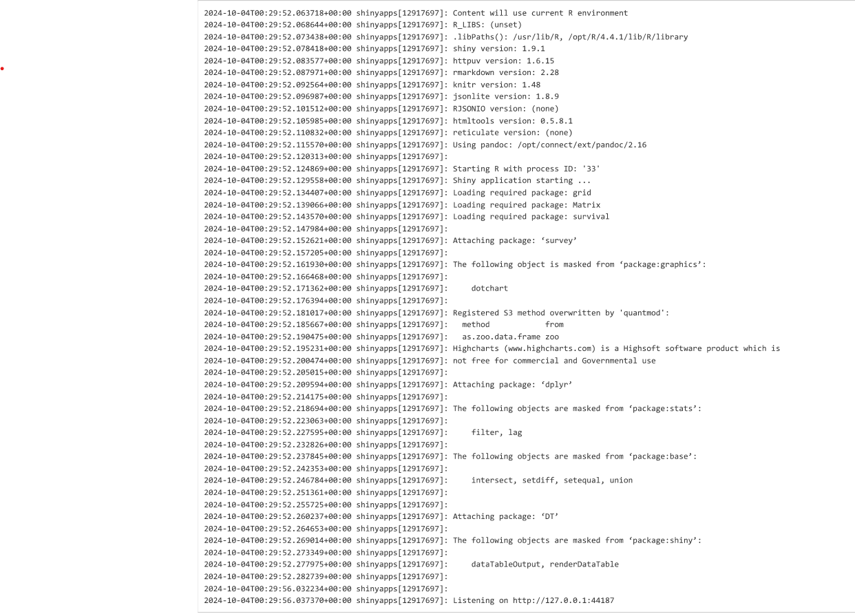
And finally the log: