Craft your bespoke Data Science degree: Pick, balance and share your courses and skills.
Authors: Dr Pawel Orzechowski, Hollie Hindley, Keith Douglas, Stan Clark
Abstract: Choosing elective courses for a university degree can be overwhelming. Our students (MSc in Data Science for Health and Social Care) need to pick 12 different courses (each with unique topics and themes)! This tool helps you to prototype and share your learning journey. It was co-created by students, interns and staff at the Usher Institute (University of Edinburgh).
Browse and pick ![]() the course options (left) to add them to your timetable (right). Use dropdowns and
the course options (left) to add them to your timetable (right). Use dropdowns and ![]() filter buttons to narrow down options. Aim for a balance of academic credits and learning themes (stats, code in R, ethics, ...). To help you start, explore pre-filled pathways, then make the final course choices uniquely yours. When done, use the special link to share your course selection with your supervisor or employer.
filter buttons to narrow down options. Aim for a balance of academic credits and learning themes (stats, code in R, ethics, ...). To help you start, explore pre-filled pathways, then make the final course choices uniquely yours. When done, use the special link to share your course selection with your supervisor or employer.
Full Description: ## What is this tool and why we've built it:
At the Usher Institute (University of Edinburgh) we teach how to make Shiny apps as one of the skills within the MSc in Data Science for Health and Social Care. That's why when we decided to build a software tool for students to craft their own pathway (course timetable), Shiny Python was an obvious choice. The journey involved students, interns and staff (admin and academic) at various stages. We followed the agile and design thinking principles, and managed to launch the tool with our new cohort of students in Sept 2024. The tool is currently under continuous development. Throughout, the code bears marks of the profile of our development team: a UX designer, React instructor and a learner with a penchant for Ockham's razor.
First steps were sticky and unfolded quickly:
We started with a 'paper prototyping' workshop involving our team of 20 staff and student interns. Four interdisciplinary groups were guided by the facilitator through the design, and evaluation of their ideas. It was inspiring to see how the focus and perceived pain-points varied between members of leadership, admin team, academics and students themselves. Everyone saw the challenge from their own perspective, but also via the lens of their empathy towards final users, who are not just the students, but also their advisors and sponsors. Each mixed team created something very different, but uniquely useful and joyful. What speaks volumes about the usefulness of starting a project with a co-design workshop is the impact it had on the current look and functionality of the dashboard. Literally every pixel, each feature, every moment in the process of using the tool – everything can be traced back to someone's contribution with a sticker, post-it, Sharpie or scissors. [here insert pictures and videos]
Turning ideas into code, and code into a working product:
After the ideation and design workshops, our development team was formed. It consisted of two interns and two lecturers, who met throughout the summer of 2024 to develop iterations of the tool in weekly sprints. At various points, feedback was gathered from other members of the academic and admin teams, and other students. Many of us have had years of experience in helping students to pick their elective courses, and contributed their understanding of the mental models and patterns that students use. Others contributed their deep understanding of all the courses and typical pathways students take – this step included crunching the analytics about past students and their choices. Finally, our course organisers contributed the themes and descriptions to their courses (this is an ongoing process), while admin and comms teams highlighted the FAQs that they wish the dashboard to address.
How collaboration with the wider team drove our features and process:
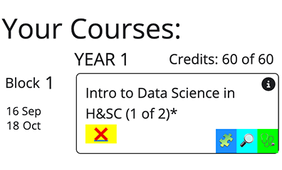
There was a number of features that came from this iterative process of sprints and consultations. Students wanted to have 'one sentence descriptions' and assessment details to be extracted (rather than browsing through multi-page course descriptors). Personal tutors wanted to help students create balanced profiles of learning, by knowing what each course focuses on (this became course themes, and personal theme profile). Supervisors and industry partners wanted an easy way to share course selections with students, but in a more interactive way than via a pdf, or hand-typed list of courses (this led us to generating custom links and parsing URLs). Leadership wanted an ability to quickly apply changes and fixes, so that the list of course is always up to date (this led us to a spreadsheet-driven data layer). Our intern really wanted to learn how to build object-oriented Python code, which guided our software architecture decisions (and very quickly paid back the initial investment of time). Finally, our comms team really wanted the tool to fit with our values, commitment to accessibility and 'professional but simple' design guidelines (which led us to the current look of the tool).
The bits of code and process we're most proud of:
-
Branches, Deployment targets (with sort of Dev-ops and Continuous Development): the code is continuously work in progress, evolving in details but also structure. At any given point we are accumulating a healthy amount of technical debt, and pruning in, like good gardeners would. See 'Main' branch for current student-facing stable version (deployed at Course Selection Tool (v1.4.13) ) and 'Development' branch for daily working versions. Course Selection Tool (v1.4.14) )
-
Pair programming - from the beginning this was meant to be a learning project, for the academic team and the interns. That's why whenever we worked together we used the pair-programming method, taking turns to code, doodle on whiteboards and discuss our technical and UX decisions.
-
GitHub flow, Branches, Pull Requests - sometimes the team was together in the room, sometimes pair-programming remotely and sometimes working asynchronously. Healthy git flow practices enabled us to avoid major problems and merge conflicts, while deploying early and often allowed us to avoid features that are not enabled on Shiny server, but work on local machines.
-
Object Oriented Python and Shiny: We used various software patterns we liked or found useful: object-oriented design, singleton (sort of), service, factory, model view controller, typical React-like features, async await.
-
Trello for kanban of tasks and sprints - we initially used Trello, then GitHub projects, and now finally the kanban tool built into Teams to keep track of our sprints, remaining tasks and progress.
-
Data Layer using CSVs (so that team can edit them in Excel) - team members can branch off in git, edit the spreadsheets (e.g. to add a new course, or edit its details) and then create a Pull Request with those changes.
-
Stubbornly use Python, not JavaScript - we really wanted to do ALL OF IT in Python. All interactions, all responsiveness, all design. For the most part we managed to not yield to the temptation of using JS to achieve interactivity, instead using Reactive patterns and CSS classes.
-
Buttons and event-driven design - Buttons in Shiny are inputs that hold a number of how many times they were clicked (start at 0, then when clicked becomes 1, then 2 etc). But with our large number of data-generated (not hard coded) buttons, we needed a way to know which button was clicked (since all buttons 'triggered' the same behaviour/function)! We used a matrix of all buttons and their 'previously known' state, to compare it when any button was clicked, from which we can deduce which one is the current 'click target'.
-
Model View Controller Data MVC+D pattern – separating data representation, data storage, decisions and user interface - we continuously learn how to apply maintainable code practices in objective Python and Shiny. Separating core layers of the dashboard has definitely helped to make this project more GitHub- and teamwork- friendly.
-
CSS designs, assembled on the fly to reflect changes in the Model - when a course is selected, it appears elsewhere, and the original course button gets greyed out. To achieve this, we swap CSS classes of Shiny html outputs based on their state (e.g. Selected, not-selected). Often CSS is used to hide and unhide views, for better UX.
-
Experimenting with AI coding companions - seeing as many of our students use GitHub Copilot, we decided at some point to try using it too. Overall, it was not a time-saving activity (over half of the suggestions are misleading, made up, or just plain wrong). This could be because our project is very bespoke and is using an unusual combination of software patterns and techniques. Still, we're determined to continue learning how to use Copilot.
-
Generating links and parsing URLs - we really wanted to avoid forcing users to create accounts. The solution to this was inspired by the way the Shiny Python prototyping IDE carries code in a long zipped URL string. One of the dashboard's features is the ability to generate a URL that carries the information about currently selected courses. And then, when the dashboard is opened using this URL, it is parsed and the indicated courses already show as selected.
-
Visual style with simple and strong primary colours and 'CTA's (Call to Action) - we are very inspired by the gov.uk design system, its sparse use of colour, shapes and backgrounds. But also we are huge fans of using pre-attentive attributes in design, and obviously emojis.
-
Accessibility debt we are aware of- in one of our next sprints we will address tab-driven navigation, and screen reader support.
Shiny app: Course Selection Tool (v1.4.13)
Repo: GitHub - DDI-Talent/course-dashboard: A Shiny dashboard for students to choose courses and be able to share a URL with their advisor
Thumbnail:
Full image: