Here are some examples along the lines you described.
(BTW, I heartily recommend the R4DS book, available free online, especially the chapters on data visualization and data transformation. I think it would give you a good idea about different ways to explore the kind of question you posed.)
library(tidyverse)
library(lubridate)
example_data <-
tibble(date = seq.Date(from = ymd(20160101),
to = ymd(20171231),
by = "day"),
daily_instances = rnorm(length(date), 10, sd = 2) %>% as.integer()) %>%
uncount(weights = daily_instances) %>%
mutate(value = rnorm(length(date), 100, 5))
example_data_summary <-
example_data %>%
group_by(year_week = floor_date(date, "1 week")) %>%
summarize(count = n(),
sum = sum(value))
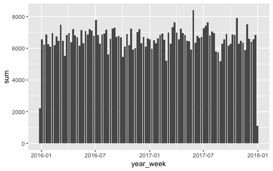
# This shows the sum of each week's values like your first post.
ggplot(example_data_summary, aes(x = year_week, y = sum)) +
geom_col()
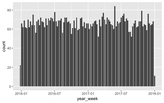
# This shows the count of how many instances there are per week, like your 2nd post.
# (But it doesn't use the "y" variable you mentioned in your first post.)
ggplot(example_data_summary, aes(x = year_week, y = count)) +
geom_col()