Is this what you want?
library(ggplot2)
library(dplyr)
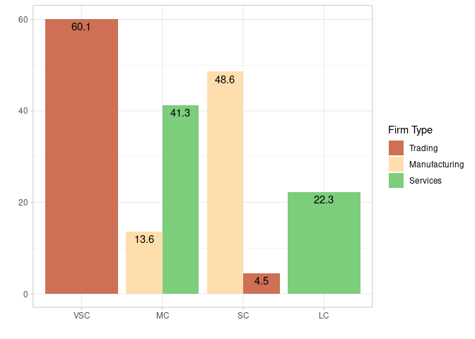
average_taxgain_reshaped <- data.frame (company_size = c("VSC", "VSC", "VSC", "SC", "SC", "SC", "MC", "MC", "MC", "LC", "LC", "LC"),
variable = c("Trading", "Trading", "Trading", "Trading", "Manufacturing", "Manufacturing", "Manufacturing", "Manufacturing", "Services", "Services", "Services", "Services"),
value = c("40.8", "11.8", "7.5", "4.5", "35.7", "12.9", "8.4", "5.2", "41.3", "10.2", "8.4", "3.7"))
average_taxgain_reshaped %>%
group_by(company_size, variable) %>%
summarise(value = sum(as.numeric(value)), .groups = "drop") %>%
ggplot(aes(x = reorder(company_size, -value),
y = value,
fill = variable)) +
geom_col(position = "dodge") +
geom_text(aes(label = value), vjust = 1.5,
position = position_dodge(width = 0.9)) +
ylab("") +
xlab("") +
scale_fill_manual(values = c(Trading = "salmon3",
Manufacturing = "navajowhite1",
Services = "palegreen3"),
name = "Firm Type") +
theme_light()
Created on 2022-06-02 by the reprex package (v2.0.1)