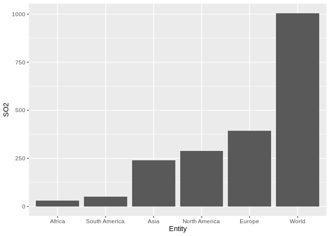
Are you looking for something like this?
dataset <- read.csv(file = 'so-emissions-by-world-region-in-million-tonnes.csv')

library(ggplot2)

ggplot(data = dataset) +
    geom_col(mapping = aes(x = reorder(x = Entity,
                                       X = SO2),
                           y = SO2)) +
    labs(x = 'Entity')
Created on 2019-06-23 by the reprex package (v0.3.0)