Thanks again John. Truly appreciate your time.
The fill you specified is 100 percent correct; but I think the x-axis is incorrect?
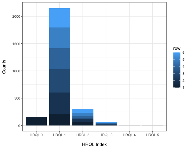
I am trying to specify the x-axis in terms of the health states (health related quality of life on a scale of 0-5).
Therefore, a graph with the x-axis as follows, but with the fill the same as your own, where the fill represents the 6 different variables (MR....Anx)?
dat <- read.table(text = "HRQL-0	HRQL-1	HRQL-2	HRQL-3	HRQL-4 HRQL-5
MR	155	211	64	14	1	1
Mob	0	393	51	2	0	0
SC	0	427	12	7	0	0
Act	0	386	45	15	0	0
Pain	0	379	62	5	0	0
Anx	0	355	73	18	0	0", header = TRUE)

dat$row <- seq_len(nrow(dat))
dat2 <- melt(dat, id.vars = "row")

ggplot(dat2, aes(x = variable, y = value, fill = row)) +
  geom_bar(stat = "identity") +
  xlab("\nHRQL Index") +
  ylab("Counts\n") +
  theme_bw()