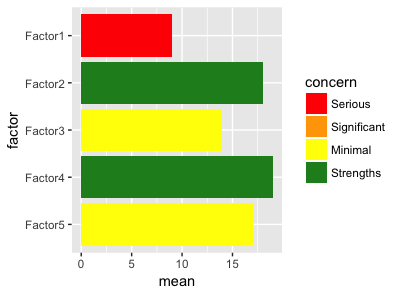
Try making your palette a named vector, with names matching your factor levels, in order to control which color gets matched to what. Per the docs:
If this is a named vector, then the values will be matched based on the names. If unnamed, values will be matched in order (usually alphabetical) with the limits of the scale.
The named vector approach is the recommended one (but this advice is a bit buried — it's mentioned in a comment to one of the examples in the docs).
So in your case:
#Colour Palette
pal <- c(
  "Serious" = "red",
  "Significant" = "orange",
  "Minimal" = "yellow",
  "Strengths" = "forestgreen"
)

df %>%
  ggplot(aes(x = factor, y = mean, fill = concern)) +
  geom_col() +
  coord_flip() +
  scale_x_discrete(limits = rev(levels(df$factor))) +
  scale_fill_manual(
    values = pal,
    limits = names(pal)
  )
Adding limits to scale_fill_manual ensures that all the levels will appear in the legend, even if they don't all appear in the data (as in this case).

If you want your legend to be in the reverse order (Strengths –> Serious), then either change the order of the elements in pal, or add this to the end of your ggplot() call:
+ guides(fill = guide_legend(reverse = TRUE))
I'm not sure I follow this bit — is it an additional thing you want the plot to do that it doesn't do, or just an explanation of your approach so far? (if the latter, I say ![]() )
)