The short answer is simply, that's how scatterplot does it by default.
The longer answer requires looking at help(scatterplot)
The smooth argument is usually either set to TRUE or FALSE to draw, or omit, the smoother. Alternatively smooth can be set to a list of arguments. The default behavior of smooth=TRUE is equivalent to smooth=list(smoother=loessLine, var=!by.groups, lty.var=2, lty.var=4), specifying the smoother to be used, including the variance smooth, and the line widths and types for the curves. You can also specify the colors you want to use for the mean and variance smooths with the arguments col.smooth and col.var. Alternative smoothers are gamline which uses the gam function from the mgcv package, and quantregLine which uses quantile regression to estimate the median and quartile functions using rqss from the quantreg package. All of these smoothers have one or more arguments described on their help pages, and these arguments can be added to the smooth argument; for example, smooth = list(span=1/2) would use the default loessLine smoother, include the variance smooth, and change the value of the smoothing parameter to 1/2. For loessLine and gamLine the variance smooth is estimated by separately smoothing the squared positive and negative residuals from the mean smooth, using the same type of smoother. The displayed curves are equal to the mean smooth plus the square root of the fit to the positive squared residuals, and the mean fit minus the square root of the smooth of the negative squared residuals. The lines therefore represent the comnditional variabiliity at each value on the horizontal axis. Because smoothing is done separately for positive and negative residuals, the variation shown will generally not be symmetric about the fitted mean function. For the quantregLine method, the center estimates the median for each value on the horizontal axis, and the variability estimates the lower and upper quartiles of the estimated conditional distribution for each value of the horizontal axis.
If you are only interested in the line, and not the boxplot, confidence bands or the solid blue intercept slope line, two other options are available. The first uses base::plot and the other uses ggplot2. If you need the boxplot, we'll need to work with the arguments to scatterplot to see if the output can be skinnied down.
The base method
plot(weight ~ height, data = women,
     main="Women Age 30-39",
     xlab="Height (inches)",
     ylab="Weight (lbs.)")
lines(women)
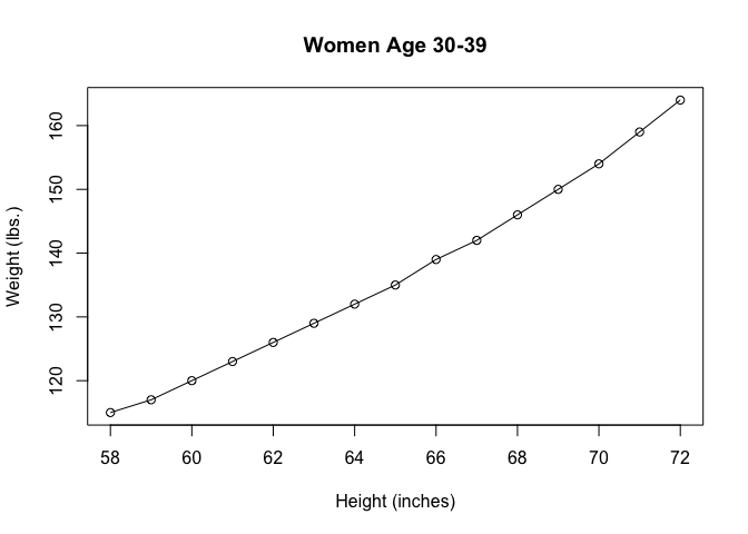
Created on 2020-04-06 by the reprex package (v0.3.0)
One of almost endless ways with ggplot2(tweaked from the default grey background)
suppressPackageStartupMessages(library(ggplot2))

# isolated to make plotting more generic

dataset <- women
headline <- "Women Age 30-39"
x_lab = "Height (inches)"
y_lab = "Weight (lbs.)"

# create the base object
p <- ggplot(dataset, aes(weight,height))
# add points
p + geom_point()

# add lines
p + geom_line()
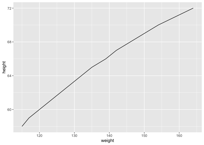
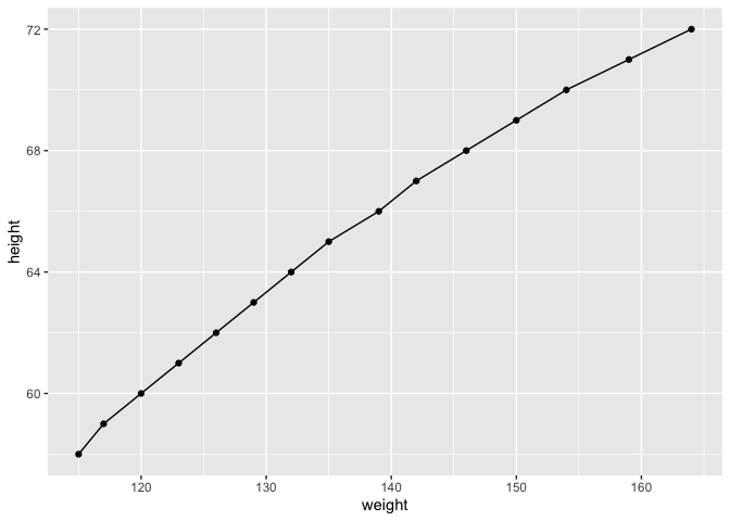
# both
p + geom_point() + geom_line()
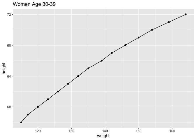
# add explanatory matter
p + geom_point() +
    geom_line() +
    labs(title = headline, xlab = x_lab, ylab = ylab)
# simplify background
p + geom_point() +
    geom_line() +
    labs(title = headline, xlab = x_lab, ylab = ylab) +
    theme_minimal()
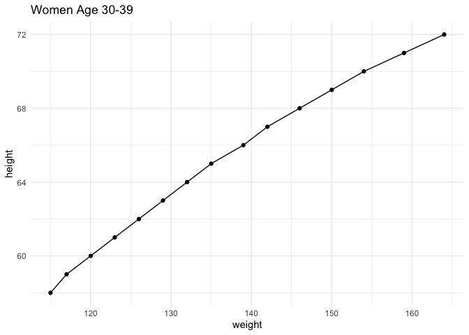
Created on 2020-04-06 by the reprex package (v0.3.0)
BTW: Because code in the OP relies entirely on base functions and datasets, it doesn't really require checking the FAQ: What's a reproducible example (`reprex`) and how do I create one? Using a reprex, complete with representative data will attract quicker and more answers.