ScotPHO Online Profiles Tool:
Shiny app for exploring Scottish public health data within local areas
Shiny app: https://scotland.shinyapps.io/ScotPHO_profiles_tool/
RCloud project:https://rstudio.cloud/project/256533
GitHub Repo: https://github.com/ScotPHO/scotpho-profiles-tool
Intro
ScotPHO is the Scottish Public Health Observatory, a collaboration between a number of Scottish public sector & academic organisations aiming to provide public health information for Scotland.
Overview of the app
This app was created to help people living and working in Scotland explore how geographical areas have changed over time or how they compare to other areas, across a range of indicators of health and wider determinants of health. The dataset behind the app is large and complex, containing trend and geographical/organisational information for over 150 indicators. The app provides users with an assortment of custom interactive visualisations enabling them to examine either a single indicator or a suite of indicators related to a particular theme (e.g. health & wellbeing, children and young people, alcohol, etc).Users can download all visualisations and the data behind it at any point.
Following the initial launch we have carried several rounds of user testing. The design of our app is centred around our user needs and feedback. Updating the app will be an ongoing process as we respond and adapt to ever evolving organisational structures and user needs.
A few features
Landing page
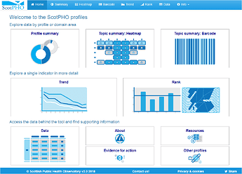
The app opens with a landing page designed to illustrate what the app can do and to aid navigation between the various visualisations. This feature was incorporated after initial user testing suggested our users preferred this route of navigation over the nav bar panel. The interactive navigation buttons were achieved using action buttons formatted using css so users see a brief description of where the button takes them.
Variety of interactive visualisations
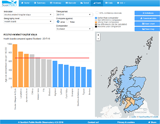
The app includes a variety of different charting techniques such as line charts, bar charts and heatmaps built using ggplot and plotly. There is also mapping drawn with the Leaflet package. All visualisations include options to download the images as png files or to download data behind the visual in csv format. Following user feedback we have made the inclusion of more statistical chart elements like confidence intervals optional. All of our visualisations are colour blind friendly and they adjust automatically to the size of the dataset used providing consistent visualisations.
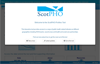
Modal dialog boxes are used within the app to provide notifications about app updates, user guidance and background information such as indicator definitions. The landing page module contains links to a tour facility for new users and also a section identifying indicators that have been updated in the last two months. The ‘Esc’ option to close the modals is always available for any of our more impatient users…
Authors
Jaime Villacampa
Zsanett Bahor
Vicky Elliott


