Exploring the lyrics to the three-volume album, 69 Love Songs, by The Magnetic Fields
My submission to the Shiny Contest is also my first completed and deployed Shiny App (so be kind!):
Here's an introduction to the app as taken from the first page:
"In 1999, the indie-pop band Magnetic Fields released the album 69 Love Songs. Conceived and written by frontman, Stephin Merritt, it is a three-volume concept album containing (yep, you guessed it) 69 love songs.
Merritt has described the album as "...not remotely an album about love. It's an album about love songs..."
So, what does Stephin sing about when he sings about love (songs)?
Play with this interactive tool and find out!"
Overview
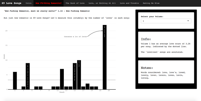
Inspired by the 'Tidy Text Mining' book by Julia Silge and David Robinson, it is built largely around the tidytext and tidyverse packages. Besides some ggplot2 plots, the app also includes:
-
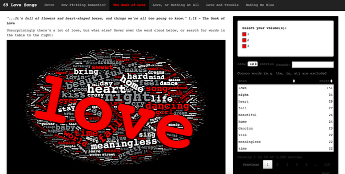
Interactive Wordcloud using the
wordcloud2package. -
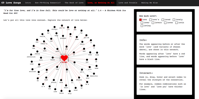
Bigram network graph using the
visNetworkpackage. This paired very nicely with thetidygraphpackage. I was going to create aggraphplot, but thevisNetworkpackage has interactive functionality. I only discovered it on Thursday but will certainly be using it again.
I had initially scraped the lyrics (from genius.com) around October last year using rvest package (scrape program is Magnetic Fields 69 Love Songs.R) and had started some analysis. But had put it to one side, until deciding last Wednesday (27th Feb) to pick it up again and turn it into an app. So I've learnt a lot about Shiny (and CSS/HTML) in the last week and a half!
Some Screenshots from the app
Aesthetics
The font and colours used in the app have been chosen to match the album artwork as best I could (see separate CSS file, styles.css, in the RStudio project). I've tried to have some fun with it, and included pertinent (perhaps tenuous) lyrics from the album on each page.
Limitations
I've just discovered on deploying the app that not all features render well on mobile devices. The worclould and network graph are good, but the ggplots get a bit messed up! Something to improve for Shiny App Number 2! All suggestions on how I can improve the app (and future apps) are welcome.
More on the app
I intend to expand more on the process of making the app on my blog before Friday: https://davidsmale.netlify.com/portfolio/. I had a lot of fun making it.
Thanks!
David / committedtotape


