with the above data in df I did
library(tidyverse)
wdf <- filter(df,
Fabric=='Walking')
wlm <- lm(formula = carcommute ~ poly(commutetime, 2,raw=TRUE),
data = wdf)
wdf$pred <- predict(wlm,newdata = wdf)
adf <- filter(df,
Fabric=='Automobile')
alm <- lm(formula = carcommute ~ poly(commutetime, 2,raw=TRUE),
data = adf)
adf$pred <- predict(alm,newdata = adf)
tdf <- filter(df,
Fabric=='Transit')
tlm <- lm(formula = carcommute ~ commutetime,
data = tdf)
tdf$pred <- predict(tlm,newdata = tdf)
all_df <- wdf %>% union_all(adf) %>% union_all(tdf)
label_centers <- select(all_df,
carcommute,commutetime,
Fabric) %>% group_by(Fabric) %>% summarise_all(mean)
(equations_df <-tibble(
Fabric = c("Walking","Automobile","Transit"),
intercept = c(wlm$coefficients[[1]],
alm$coefficients[[1]],
tlm$coefficients[[1]]),
deg1 = c(wlm$coefficients[[2]],
alm$coefficients[[2]],
tlm$coefficients[[2]]),
deg2 = c(wlm$coefficients[[3]],
alm$coefficients[[3]],
NA_real_)) %>% mutate_if(is.numeric,~round(.,digits=3)))
equations_df$deg1sign <- if_else(equations_df$deg1>0,"+","-")
equations_df$deg2sign <- if_else(equations_df$deg2>0,"+","-")
equations_df$deg1 <- abs(equations_df$deg1)
equations_df$deg2 <- abs(equations_df$deg2)
equations_df$deg2sign <- if_else(is.na(equations_df$deg2sign),"",as.character(equations_df$deg2sign))
equations_df$deg2 <- if_else(is.na(equations_df$deg2),"",as.character(equations_df$deg2))
equations_df <- equations_df %>%
mutate(eq_text = paste("y =",intercept,
deg1sign,deg1,"x",deg2sign,deg2,"x^2",sep = " "))
equations_df<- left_join(equations_df,label_centers)
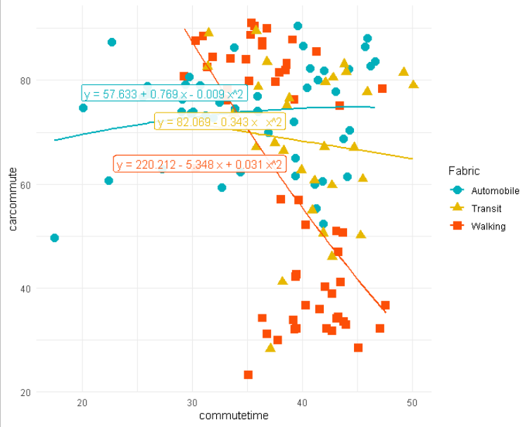
all_df %>%
ggplot(aes(x = commutetime, y = carcommute, color=Fabric, shape = Fabric)) +
geom_point() +
theme_minimal()+
geom_point(size = 3.5, aes(color = Fabric, shape = Fabric))+
geom_line(mapping = aes(y=pred), size = 1)+
scale_color_manual(values = c("#00AFBB", "#E7B800", "#FC4E07"))+
scale_fill_manual(values = c("#00AFBB", "#E7B800", "#FC4E07")) +
geom_label(data=equations_df,mapping =aes(label=eq_text), alpha=.9,nudge_x = -8,nudge_y=4,show.legend = FALSE)