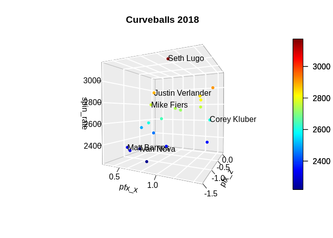
You can use text3D like below:
library(plot3D)

dataset <- data.frame(pfx_x = c(1.2801, 1.4832, 0.8468, 1.2693,
                                0.7742, 0.8887, 1.345, 0.2434,
                                0.2265, 1.0191, 0.7771, 0.6602,
                                0.2674, 1.3204, 0.9374, 1.0393,
                                1.1216, 1.1721, 0.5008, 0.3581),
                      pfx_z = c(-0.1505, -0.9219, -0.8252, 0.1453,
                                -1.2502, -1.1027, -0.9784, -0.538,
                                -0.4363, -1.2088, -1.0922, -1.0819,
                                -0.9684, -0.8126, -1.5168, -0.7752,
                                -1.2417, -0.1258, -0.5164, -1.037),
                      spin_rate = c(2360, 2923, 2357, 2607,
                                    2613, 2649, 2852, 2250,
                                    2507, 3174, 2894, 2220,
                                    2319, 2824, 2771, 2729,
                                    2744, 2766, 2457, 2300),
                      woba = c(0.259, 0.212, 0.268, 0.143,
                               0.257, 0.236, 0.275, 0.187,
                               0.261, 0.199, 0.156, 0.241,
                               0.197, 0.314, 0.161, 0.209,
                               0.269, 0.478, 0.25, 0.25),
                      player_name = c("Jose Berrios", "Charlie Morton", "Felix Hernandez", "Corey Kluber",
                                      "Miles Mikolas", "Jameson Taillon", "Sonny Gray", "Ivan Nova",
                                      "Domingo German", "Seth Lugo", "Justin Verlander", "Chase Anderson",
                                      "Matt Barnes", "Rick Porcello", "Mike Fiers", "Stephen Strasburg",
                                      "Tanner Roark", "Noe Ramirez", "Jon Gray", "Jordan Lyles"),
                      stringsAsFactors = FALSE)

with(data = dataset,
     expr = {
       scatter3D(x = pfx_x,
                 y = pfx_z,
                 z = spin_rate,
                 phi = 1,
                 theta = 26,
                 bty = "g",
                 pch = 20,
                 cex = 1,
                 ticktype = "detailed",
                 main = "Curveballs 2018",
                 xlab = "pfx_x",
                 ylab = "pfx_z",
                 zlab = "spin_rate")
       text3D(x = pfx_x[woba < 0.200],
              y = pfx_z[woba < 0.200],
              z = spin_rate[woba < 0.200],
              labels = player_name[woba < 0.200],
              add = TRUE)
     })
Created on 2019-07-10 by the reprex package (v0.3.0)
Obviously, it doesn't look nice. You can get a much nicer plot using plotly. However, I don't know much of it as I find it's documentation difficult. Here's a code after some trial and errors using the same data set:
library(plotly)

plot_ly(data = dataset,
        x = ~pfx_x,
        y = ~pfx_z,
        z = ~spin_rate,
        type = "scatter3d",
        mode = "markers") %>%
  add_text(x = ~pfx_x[woba < 0.200],
           y = ~pfx_z[woba < 0.200],
           z = ~spin_rate[woba < 0.200],
           text = ~player_name[woba < 0.200])
I don't know how to share interactive graphs here, but you can run on your system and find the result.