Hi
apologies.
please find here:
df <- data.frame(stringsAsFactors = TRUE,
                 variable = c("Re","C","Ra","T"),
                 value = c(1.666667,	3.333333,	1.666667,	28.333333,
                           3.333333,	0.000000,	0.000000,	16.666667,
                           5.000000,	5.000000,	3.333333,	28.333333,
                           5.000000,	2.666667,	3.333333,	18.333333,
                           8.333333,	1.666667,	0.000000,	13.333333,
                           8.333333,	1.666667,	0.000000,	23.333333,
                           1.666667,	6.666667,	1.666667,	31.666667,
                           3.333333,	0.000000,	1.666667,	5.000000))
 View(df)

Violinplot <- ggplot(df, aes(variable, value)) +
  geom_violin(trim = FALSE, fill = "#008C96", colour = "black") +
  geom_boxplot(width = 0.1, size = 0.75, position = position_dodge(0.95), fill = "white", colour = "black") +
  labs(x= "pattern", y="Error rate") +
  ylim (0,40) + theme(axis.text=element_text(size=12),axis.title=element_text(size=14,face="bold"))
Violinplot
The violin plot comes out fine. but the outer contour lines are annoyingly pixelled (see image)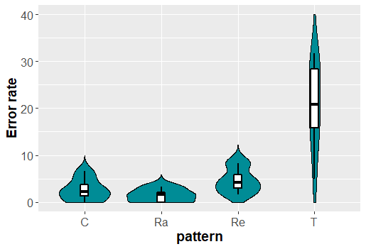
Thanks very much
Giulia