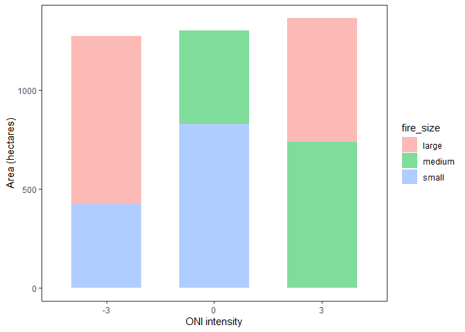
In the first method, you just need to change the position to "stacked". WIth position = "identity", each bar starts at zero and the overlap.
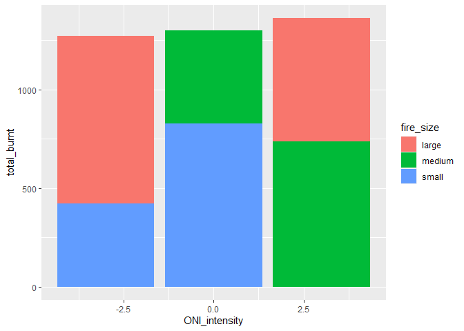
With the second method, you don't want to reshape the data to match the pivot table. ggplot() likes data in the long format that exists after the summarize function. The fire_size is a column and is mapped to the fill aesthetic.
library(tidyverse)

fire_size <- c("small", "medium", "medium", "small", "large", "large")
ONI_intensity <- c(-3, 0, 3, 0, -3, 3)
area_ha <- c(423, 473, 736, 827, 848, 626)

mydata <- data.frame(fire_size, ONI_intensity, area_ha)

mydata %>%
  ggplot(aes(x = factor(ONI_intensity),
             y = area_ha,
             fill = fire_size)) +
  geom_bar(stat = "summary",
           fun = sum,
           position = "stack",
           alpha = 0.5,
           width = 0.65) +
  theme_bw() +
  theme(panel.grid.major = element_blank(),
        panel.grid.minor = element_blank()) +
  labs(x = "ONI intensity", y = "Area (hectares)")
mydata2 <- mydata %>%
  group_by(ONI_intensity, fire_size) %>%
  summarise(total_burnt = sum(area_ha))
#> `summarise()` has grouped output by 'ONI_intensity'. You can override using the
#> `.groups` argument.

ggplot(mydata2, aes(x = ONI_intensity, y = total_burnt, fill = fire_size )) +
  geom_col()
Created on 2022-11-09 with reprex v2.0.2