So from your edited question, it seems you are ok with doing this in either ggplot or googleVis. Since I have never used googleVis, I can not help you with that. As for ggplot, you are factoring the wrong variable to order the bars. You need to factor the data_source column and the data_type column (Assuming you want the legend ordered in a specific way).
If you replace your plotData <- da with this:
library(dplyr)
plotData <- da %>%
  arrange(count) %>%
  mutate(
    data_source = factor(data_source, levels = data_source),
    data_type = factor(data_type, levels = c("FUNDING_PROJECT",
                                             "SCIENT_PUBLICATION",
                                             "PATENT","NEWS"))
  )
Then remove your factor statement (you could leave it but it is just redundant). Since you set the colors in your scale_fill_manual function I am assuming you are happy with those colors. If you want the exact colors shown in your example then you can use @daattali's color picker to try and match them as closely as possible.
If you leave the colors as you have them, then adding the above code prior to your ggplot code will give you this:
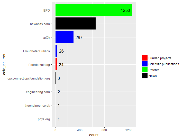
The count for the News category is there but if you leave the fill color as black then the text does not show.