Assuming all of these are just counts that are independent from one another, you could consider a bar chart?
Note that my use of tribble is to format the data you have provided into data frames. It is more useful to provide a reproducible example that can easily be copy-pasted:
FAQ: What's a reproducible example (reprex) and how do I create one?
library(tidyverse)
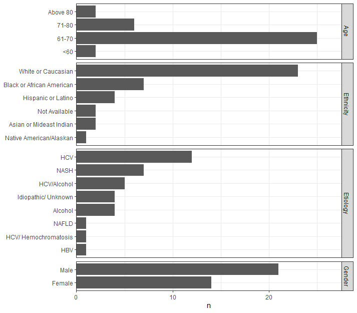
etiology <-
tribble(
~cat, ~n,
"HCV", 12,
"HCV/Alcohol", 5,
"HCV/ Hemochromatosis", 1,
"Alcohol", 4,
"HBV", 1,
"NAFLD", 1,
"NASH", 7,
"Idiopathic/ Unknown", 4
) %>%
mutate(cat = fct_reorder(cat, n))
age <-
tribble(
~cat, ~n,
"<60" ,2,
"61-70" ,25,
"71-80" ,6,
"Above 80" ,2
) %>%
mutate(cat = factor(cat))
gender <-
tribble(
~cat, ~n,
"Female", 14,
"Male", 21
) %>%
mutate(cat = fct_reorder(cat, n))
ethnicity <-
tribble(
~cat, ~n,
"Hispanic or Latino", 4,
"Native American/Alaskan", 1,
"Black or African American", 7,
"Asian or Mideast Indian", 2,
"White or Caucasian", 23,
"Not Available", 2
) %>%
mutate(cat = fct_reorder(cat, n))
all_data = bind_rows(
mutate(ethnicity, type = "Ethnicity"),
mutate(gender, type = "Gender"),
mutate(etiology, type = "Etiology"),
mutate(age, type = "Age")
)
ggplot(all_data, aes(x = n, y = cat)) +
geom_col() +
facet_grid(type~., scales = "free", space = "free") +
theme_bw() +
labs(y = NULL) +
scale_x_continuous(expand = expansion(c(0,.1)))