Hi, I meet another problem when i learning R.
(1)A set of data, divided them and counting the number of individuals each range.
(2)Plot a histogram to show (1), the vertical coordinate is the number.
(3)Then get the predict value of the number each range by using different probability density functions.
(4)Then get many lines of predicting number. Plot them in one graph.
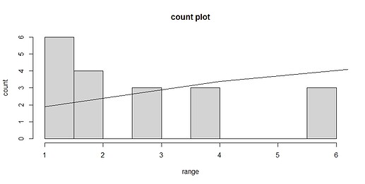
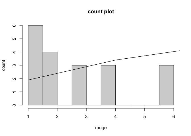
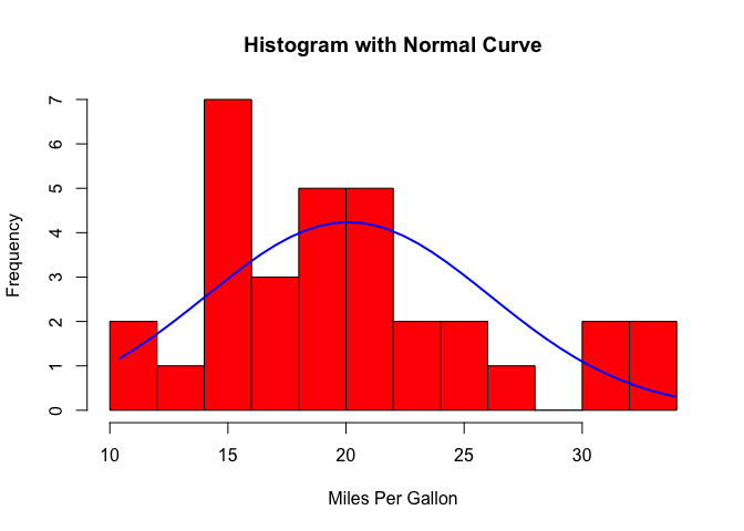
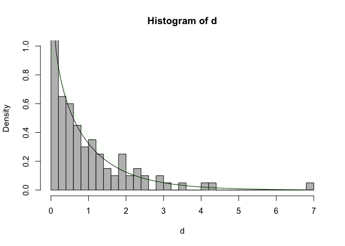
There seems to be a problem with the graph I drew, there are gaps in the middle and the horizontal coordinates are not in the centre of the bars. Do I get the predict values in the correct way? And how to draw different probability density function curves in one graph to show the predict number respectively?
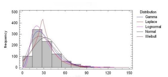
In a word, show the data distribution and the corresponding distribution functions.
Thank you for your effort and help on this problem in advance.
a1 <- c(16.6,1.0,10.1,8.6,8.0,17.0,2.4,7.6,5.7,11.6,3.6,2.8,6.3,1.5,2.7,16.7,6.7,5.3,12.5)
bins <- seq(min(a1), max(a1) + 3, by = 3)
a1_bin <- cut(a1, bins, right = FALSE, labels = FALSE)
hist(a1_bin, breaks = length(bins)+1, main = "count plot", xlab = "range", ylab = "count")
M<-mean(a1)
s<-sd(a1)
x<-bins
y<-dnorm(bins,M,s)
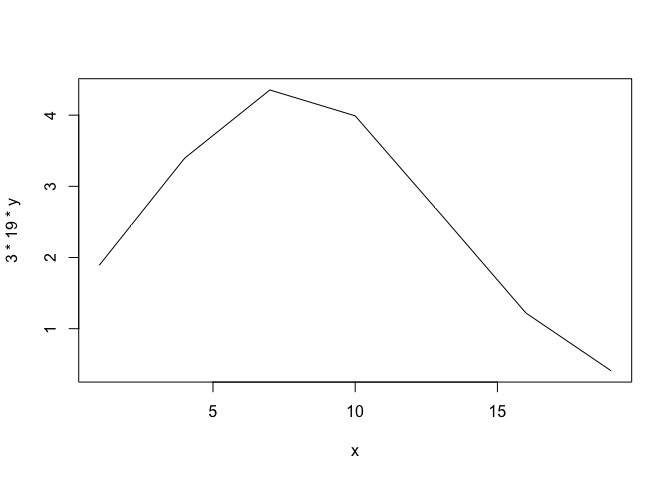
lines(x,3*19*y)
The 3 is the interval, 19 is the length of a1.
Created on 2023-03-25 with reprex v2.0.2
