@Lernst. If you want the grey separate line background, the x values cannot be character. Change the x values to numeric and use scale_x_continuous to label the x axis. Then, in theme, use panel.grid.minor.y to plot the separate line.
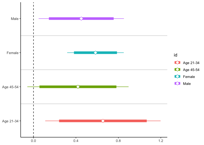
library(tidyverse)

df <- data.frame(id = factor(c("Male", "Female", "Age 21-34", "Age 45-54")),
                 mean = c(.4503, .5841, .6543, .4189),
                 se = c(.1558, .1034, .2108, .1850), stringsAsFactors = FALSE)

df %>%
  rowwise() %>%
  mutate(CI95 = list(c(mean + 1.96 * se, mean - 1.96 * se)),
         CI99 = list(c(mean + 2.58 * se, mean - 2.58 * se))) %>%
  unnest(c(CI95, CI99)) %>%
  ggplot() +
  labs(x = NULL, y = NULL) +
  geom_line(aes(x = as.numeric(id), y = CI99, group = id, color = id)) +
  geom_line(aes(x = as.numeric(id), y = CI95, group = id, color = id), size = 3) +
  geom_point(aes(x = as.numeric(id), y = mean, color = id), fill = "white", shape = 23, size = 3) +
  geom_hline(yintercept = 0, linetype = "dashed") +
  scale_x_continuous(labels = c("Age 21-34", "Age 45-54", "Female", "Male"), limits = c(0.7, 4.3), breaks = 1:4) +
  theme_classic() +
  theme(panel.grid.minor.y = element_line(color = "gray")) +
  coord_flip()
Created on 2019-10-14 by the reprex package (v0.3.0)