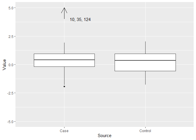
Here is a start at doing that sort of thing with ggplot.
library(ggplot2)
DF <- data.frame(Source = c(rep(c("Case", "Control"),30),
                            "Case", "Case", "Case"),
                 Value = c(rnorm(60), 10, 35, 124))
ggplot(DF, aes(Source, Value)) + geom_boxplot() +
  coord_cartesian(ylim = c(-5, 5)) +
  geom_segment(aes(x = "Case", y = 4, xend = "Case", yend = 5),
               arrow = arrow(length = unit(0.05, "npc"))) +
  annotate(geom = "text", x = 1.2, y = 4, label = "10, 35, 124")

Created on 2022-02-21 by the reprex package (v2.0.1)