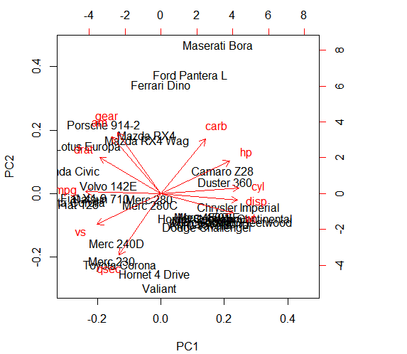
Yes, the SpeciesData is my own personal data so just running this code in r will not work. I put an example data frame in the post. I cant really provide you with the data because its very large, I am not sure I am allowed to as a grad student and there is no way for me to upload and excel file or r file. You can reproduce a similar graph be replacing "SpeciesData" with "mtcars".
Species.PCA <- prcomp(mtcars,
                   center=TRUE,
                   scale.=TRUE)
It still produces the same issue, labels are overlapping and unreadable. Its mainly just a design question, is there a way to make it look better? A diferent way of graphing or a command that I am missing?