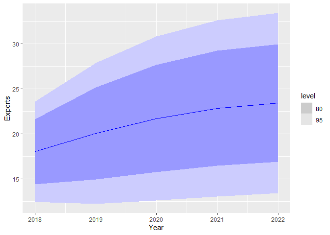
In the following example, how can I change the colors of the legend i.e. the level? Currently, they are in grey; I want them to be colored just like the main plot. Thanks!
library(fpp3)

global_economy %>%
  filter(Code == "EGY") %>%
  model(ARIMA(Exports)) %>%
  forecast(h=5) %>%
  autoplot()
Created on 2021-07-08 by the reprex package (v2.0.0)