It would be easier to help you if you posted your data in a format that is easy to copy/paste. Some help with doing that is here
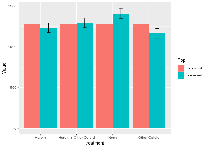
Here is one way to make your plot.
library(ggplot2)
library(tidyr)
library(dplyr)

DF <- data.frame(treatment = c("None", "Heroin", "Other Opioid", "Heroin + Other Opioid"),
                 observed = c(1410, 1235, 1166, 1294),
                 expected = c(1276,1276, 1276,1276),
                 ci_lo = c(1348, 1176, 1108, 1234),
                 ci_hi = c(1474, 1296, 1226, 1356))
DFlong <- gather(DF, key = "Pop", value = "Value", observed:expected)
DFlong <- mutate(DFlong, ci_lo = ifelse(Pop == "observed", ci_lo, NA),
                 ci_hi = ifelse(Pop == "observed", ci_hi, NA))
ggplot(DFlong, aes(x = treatment, y = Value, fill = Pop)) + geom_col(position = "dodge") +
  geom_errorbar(aes(ymin = ci_lo, ymax = ci_hi), position = position_dodge(0.9), width = 0.2)
#> Warning: Removed 4 rows containing missing values (geom_errorbar).

Created on 2020-05-08 by the reprex package (v0.2.1)