Hi @Gelci , Welcome!
For get a good help for all the community is better put a reproducible example of the data.
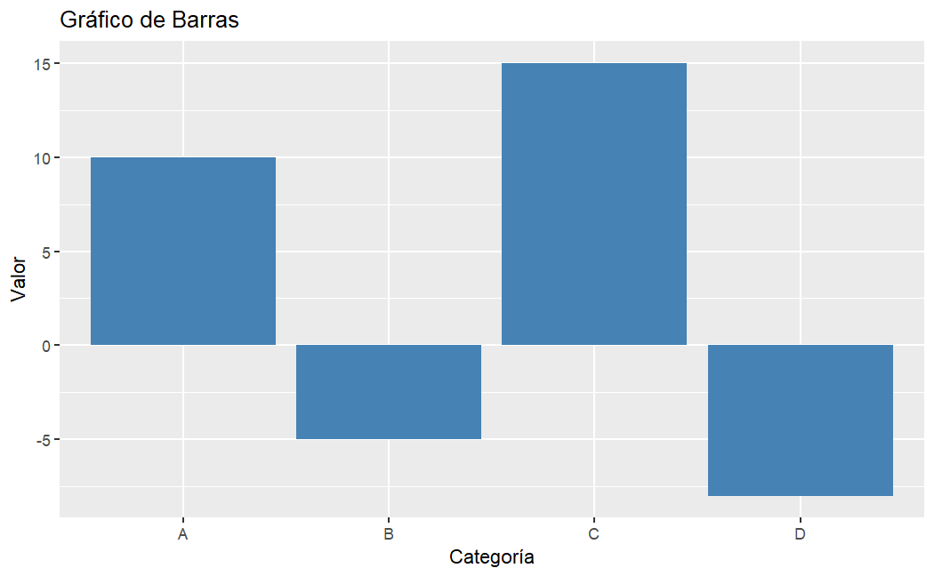
A basic example for start with this plot is something like that:
library(ggplot2)
df <- data.frame(
  Categoria = c("A", "B", "C", "D"),
  Valor = c(10, -5, 15, -8))

# Make the plot with ggplot2
ggplot(df, aes(x = Categoria, y = Valor)) +
  geom_bar(stat = "identity", fill = "steelblue") +
  labs(title = "Gráfico de Barras",
       x = "Categoría",
       y = "Valor")