It can help. It gets easier after the first 50 years.
Here are a couple of useful sources: Minimal Reproducible Example and Tips for writing questions.
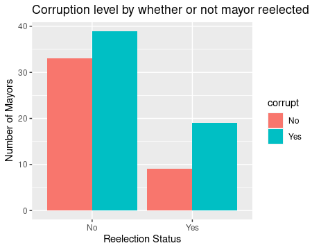
I am not sure that I understand what you want but I reduced the data set to a 4 X 3 table and plotted that.
dat3 structure(list(status = c("No", "No", "Yes", "Yes"), corrupt = c("No",
"Yes", "No", "Yes"), N = c(33L, 39L, 9L, 19L)), row.names = c(NA,
4L), class = "data.frame")
However I did this using the data.table package which is just a bit different than most of the rest of R so my code may [will?] look very weird to you. If I am on the right track, I can translate the code into standard and/or tidyverse code or leave you to explore data.table which has some very interesting features.
I named your original sample data set dat1
# read in data as data.frame called "dat1"

library(ggplot2)
library(data.table)

setDT(dat1) # convert to data.table.

# Create two new binary variables based on "reelected" & "corruption" variables
dat1[ , status := fifelse( reelected == 1, "Yes", "No")]
dat1[ , corrupt := fifelse(corruption == 0, "No", "Yes")]

 # This can be done as one step
dat2  <- dat1[, .(status, corrupt)]
dat3  <- dat2[, .N, by = .(status, corrupt)]

## plot
ggplot(dat3, aes(status, N, fill = corrupt)) + geom_bar(stat = "identity", position=position_dodge()) +
  ggtitle( "Corruption level by whether or not mayor reelected") + xlab("Reelection Status") +
  ylab("Number of Mayors")