I want to use purrr to generate some data based on some parameters.
Shown below is a script that will generate a beta density on 0 to 1 parametedized by a a and b (the columns of the dataframe params.
library(tidyverse)

a = c(2,4,6)
b = c(10,12,14)

params = expand.grid(a = a, b = b)

gen_den = function(a,b,...){
  x = seq(0,1,0.1)
  den = dbeta(x = x, shape1 = a, shape2 = b)
  return(den)
}

# Want to assign this as a nested column
params %>%
  pmap(gen_den)
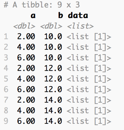
I was wondering if I could assign the results of the pmap to a column, where each observation is a nested data frame. Shown below is some desired output. Here, the data column is the output from gen_den(a,b).

library(tidyverse)

a = c(2,4,6)
b = c(10,12,14)

params = expand.grid(a = a, b = b) %>% as_tibble()

gen_den = function(a,b,...){
  x = seq(0,1,0.1)
  den = dbeta(x = x, shape1 = a, shape2 = b)
  return(den)
}

# Want to assign this as a nested column
res <- params %>%
  dplyr::mutate(data = pmap(., gen_den))

> res
# A tibble: 9 x 3
      a     b data
  <dbl> <dbl> <list>
1  2.00  10.0 <dbl [11]>
2  4.00  10.0 <dbl [11]>
3  6.00  10.0 <dbl [11]>
4  2.00  12.0 <dbl [11]>
5  4.00  12.0 <dbl [11]>
6  6.00  12.0 <dbl [11]>
7  2.00  14.0 <dbl [11]>
8  4.00  14.0 <dbl [11]>
9  6.00  14.0 <dbl [11]>
Is that what you want? Or why do you need lists in a column?
I think is is close enough to what I need. I want to plot many different parameterizations of the beta without having to do it all by hand or with a loop. This way, I can just unnest and plot with ggplot2.
Thanks for the help.
I think it'll be easier to do it in a slightly different way. One approach is:
library(tidyverse)

a = c(2,4,6)
b = c(10,12,14)

params = expand.grid(a = a, b = b) %>% as_tibble()

gen_den = function(a,b,...){
  x = seq(0,1,0.1)
  den = dbeta(x = x, shape1 = a, shape2 = b)
  return(tibble(x = x, y = den))
}

params %>%
  dplyr::mutate(data = pmap(., gen_den)) %>%
  dplyr::mutate(label = paste0("a = ", a, ", b = ", b)) %>%
  dplyr::select(data, label) %>%
  tidyr::unnest() %>%
  ggplot(., aes(x = x, y = y, color = label)) +
    geom_line()
This would produce a graph with all of the variations on the same plot, which I guess is what you are going for.
5 Likes
